

TheGuarantors 🔷
Risk rethought.
Opportunity realized.

OVERVIEW
TheGuarantors is a Fintech company that is rethinking insurance products and financial solutions for residential and commercial real estate professionals as well as their residents and tenants, to ensure that everyone wins.
TheGuarantors makes it a mission to fuel opportunity and financial advantage for everyone involved in residential and commercial leasing. They develop innovative financial products that remove the real estate market’s existing barriers to lead to success when it comes to renting spaces.
ROLES & RESPONSABILITIES
Brand Strategy, Brand Identity, Content & Messaging, Marketing Material, Website Strategy, Web Design, Strategy & UX, Wireframes, Product Design, Prototyping
OUTCOME
Shortly after joining the team as the sole Product Designer in 2017, TheGuarantors closed a Series A round of funding with a total of $11.7 million raised. TheGuarantors then entered 2019 by closing a Series B round of funding with a total of $15 million raised, ahead of the rebrand I led.
THE BRAND
Creating the intersection
French for “intersect,” the Couper represents TheGuarantors stance as the intersection of real estate, finance, insurance, and technology.
The Couper is an integral asset to TheGuarantors identity and a symbol that is applicable to all demographics. While present in the company’s icon, the general shape of the Couper will be used in different, yet effective, manners when appealing to a specific demographic.

See things from the ground-up
Leading the FinTech industry with innovative risk and financial solutions for the real estate ecosystem, TheGuarantors website needed to do a lot - and it needed to appear seamless.
On one end of the spectrum, TheGuarantors acts as a one-stop-shop for Renters, providing them with all the essentials of renting in New York City. The original product, Lease Guarantee (rebranded as `guaranti`), proved successful to international student. So the initial renter-end of the spectrum is split into two demographics: New York renters and International renters.
Along with this younger demographic, TheGuarantors was also a popular management tool used by landlords and brokers on the other side of it’s spectrum. So on boarding these clients was also a goal of the redesign.
With this new website, I wanted TheGuarantors to say more, show more, and accept more.


The Commercial Side of Things
Shortly after branching out into the Renters Insurance industry, TheGuarantors released it’s Commercial guarantee product, titled `securiti`. This added another demographic to the already very busy spectrum of clientele TheGuarantors was appealing to.
The goal for all of these products became apparent as we started to flesh out the general experience of the website. TheGuarantors needed a cohesive brand identity to apply across all product, while also allowing each product to retain it’s own identity for individual use, which was also a common practice by consumers.
QUESTIONNAIRE
To Rent, or Not to Rent
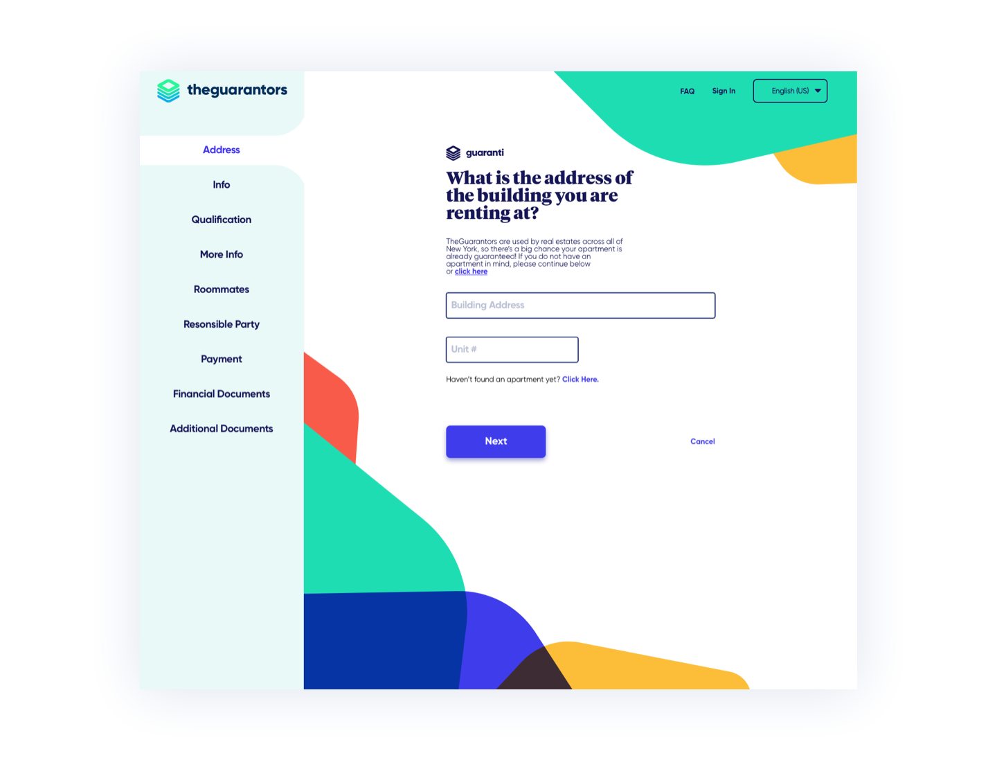
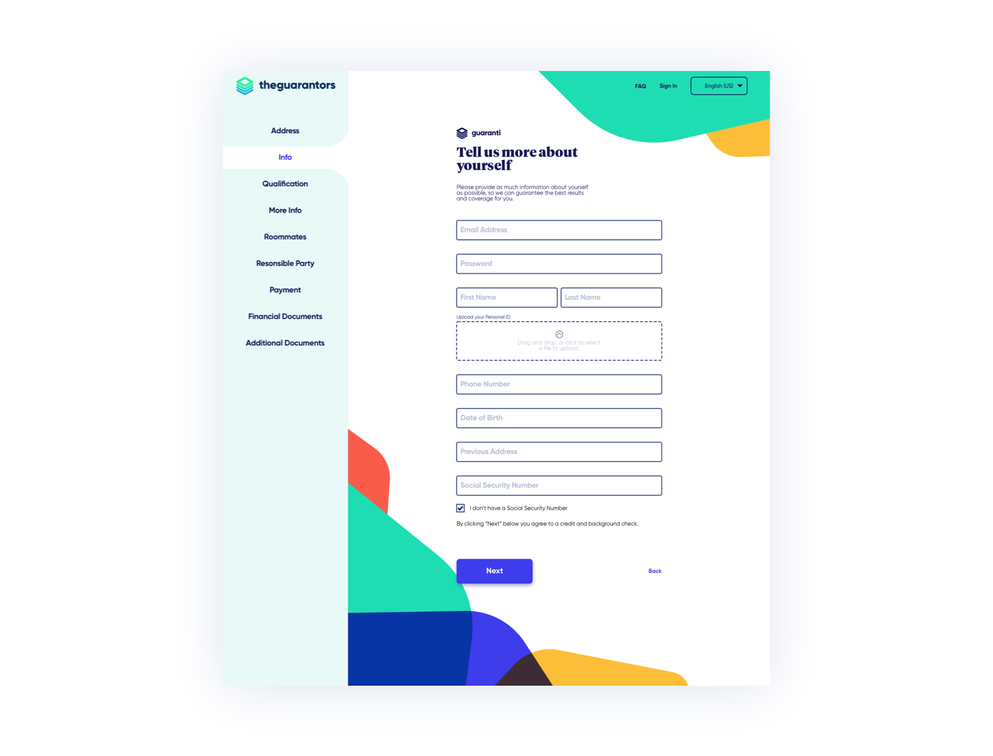
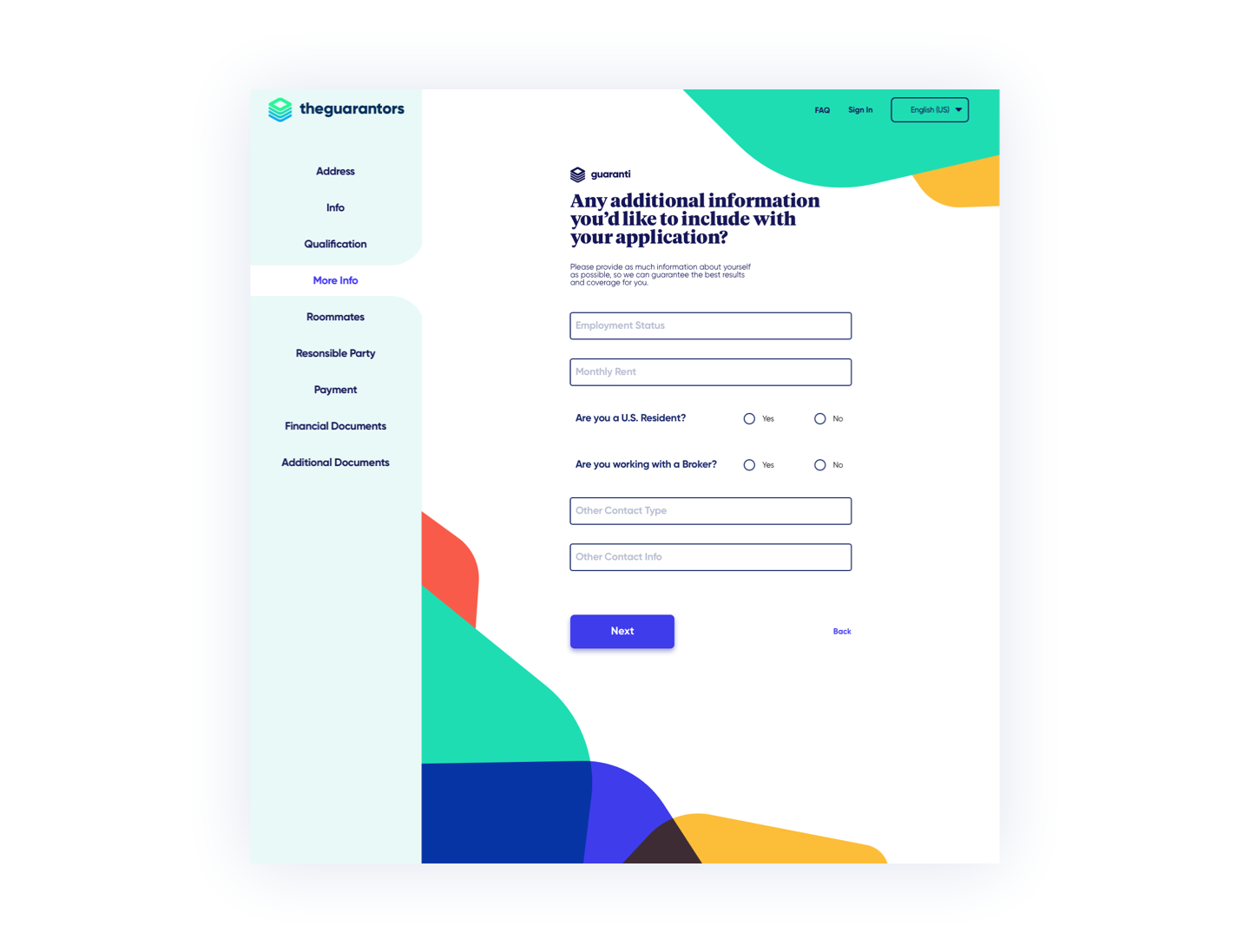
Part of what makes TheGuarantors so successful amongst Renters, is their ability to screen all applications through their website. Taking this into account, I wanted the Renters Questionnaire to be seamless, easy to use and navigate, and at the tippy-top of that list; Informative.
I worked with the Underwriting team to better understand at what points in an application is a Renter rejected, and I wanted to make sure the questionnaire helped to deter those applications, and guide them into a funnel where we can better help them.

THE PRODUCT
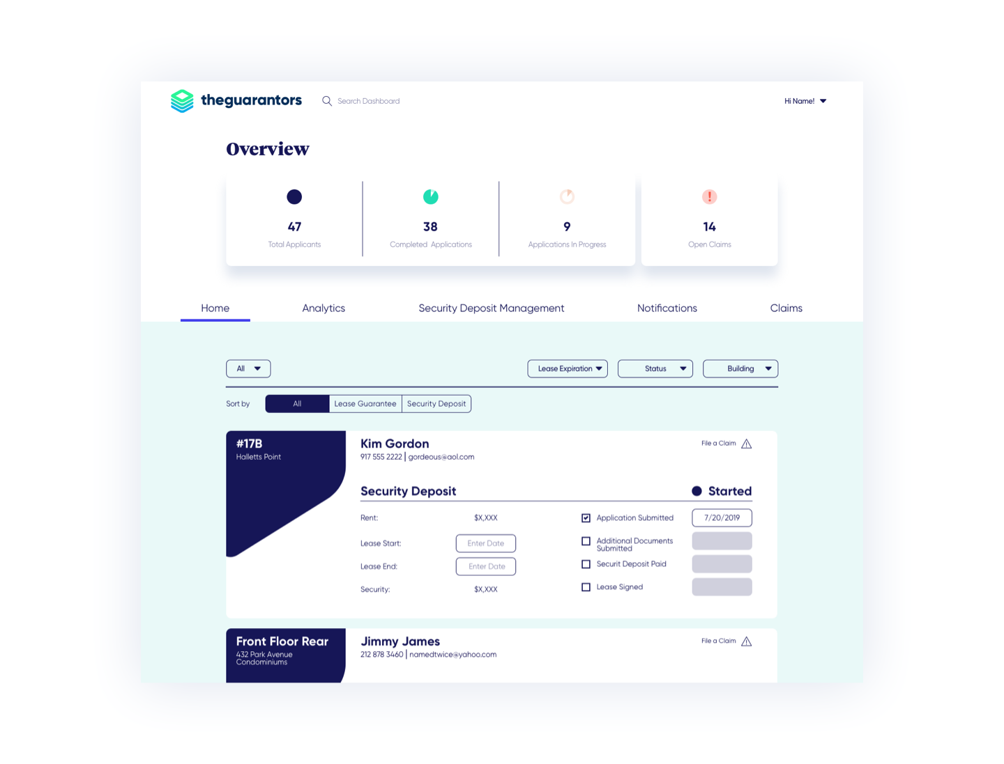
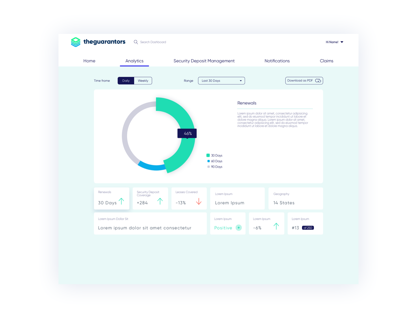
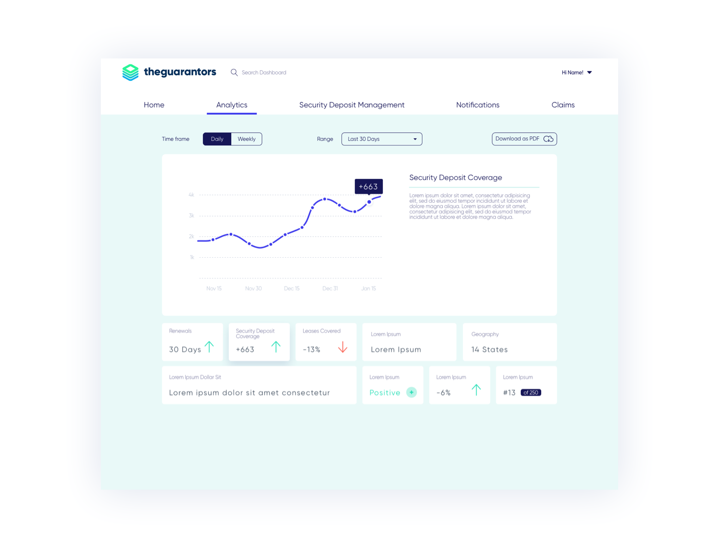
Landlord Portal
The Landlord Portal is a management dashboard created by TheGuarantors. It’s purpose was to help landlords and brokers using TheGuarantors services in managing renters. Renters insurance, insurance compliance, lease guarantee, and security deposit replacement were some of the many tools tracked with this dashboard tool.
Being that the demographic of most landlords and brokers using the tool was significantly older than the renter demographic we were accustomed to catering to, this tool needed to be more seamless and transparent than what was previously created. The goal of this tool primarily being to get a landlord and broker the information required in the fewest and simplest steps possible.
THE RESEARCH
Design System
I created a system using the Atomic Design method, a concept of design that compares the smallest of UI elements or components to atoms, which helped to ensure that everything that comes from TheGuarantors team, will always feel as though it is from TheGuarantors. Aspects including color, text, and shadow depth would be considered atoms. Combining these smaller atoms creates molecules, which are larger design components created by grouping the smaller components into assets like text input, and buttons. The specific layout of the molecules on a page are considered organisms. By grouping smaller design elements like atoms into larger organisms, I was able to expedite newer pages on the design end, and streamline the development process.
TheGuarantors new website is entirely made up of modules and is hosted by Hubspot for easy integration and editing. The modules created work as editable, pre-rendered, assets that a user can “pull & play” into a page. Some modules were even built to allow customized imagery, color, text, and color blocking, all while keeping consistency amongst TheGuarantors brand.
