Grifidi 📍
Creating a social media for protesters with big mouths, and wanderers with… big mouths.
OVERVIEW
Grifidi is a mobile application that is meant to carry a punch with each pin posted. Following the election of a certain angry Cheeto, it was thought that people needed an outlet for opinionated posts outside of social media's populated by great aunt's, hotheads, and dog filters. In comes Grifidi; where protests can happen from the comfort of your couch during a Netflix binge, or during that meeting your boss is holding cause Sharron won't stop taking other peoples lunches.
WHAT I DID
Branding, User Research, App Design, Web Design, Illustration, Market Research, Content Curation.
THE PRODUCT
Home is where the action is
The home screen had a list of features that we found absolutely necessary to the users experience, so it became the top priority to properly organize and structure hierarchy of the assets.
We combined the search feature with public viewing and location services, but allowed for enough room with proper interaction. We then ditched the overly used bottom navigation bar for three cells dedicated to the users profile, uploading of content, and notifications, respectively.

Getting around while staying stationary
As I stated before I obviously have an issue with the overly used bottom navigation bar used across almost every kind of multi-directional app on the App Store. The issue being mediocrity. For Grifidi's navigation, I dedicated a page with a more free flowing experience to accommodate all the actions the user can take within the app.

Reinventing the wheel
The status is something that hasn't been much elaborated on since Myspace first introduced them as threads. With Grifidi, we wanted the status to incorporate more elements than simply text on a screen. A user was to have the ability to design their status and emote personality however they saw fit. We also wanted to include the option to take a poll in a status.

Use of the profile
A user is driven to select their own profile out of vanity and ego, and in Grifidi's profile I wanted to feed into that. In the users profile settings, they are able to select the type of theme portrayed. The users profile also houses a map that is strictly dedicated to that specific users photos and statuses.

THE BRAND
We heard talk about a wall, so we made a smarter one...
The Grifidi brand was created after extensive research on the market and an intricate competitor analysis of social medias. The driving force behind the concept was "we want it to look cool on a shirt," so taking that into account I paired a minimalist icon with a hand-lettered logotype. In our online presence we depended mainly on gradients of primary colors, so in our marketing material we thought to contrast that in very mute colors, effectively creating a clean look.


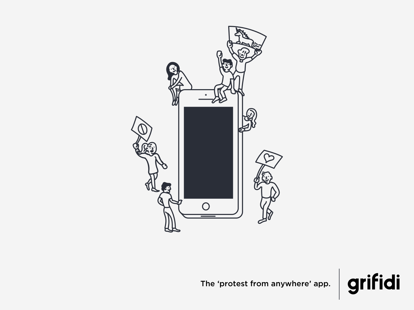
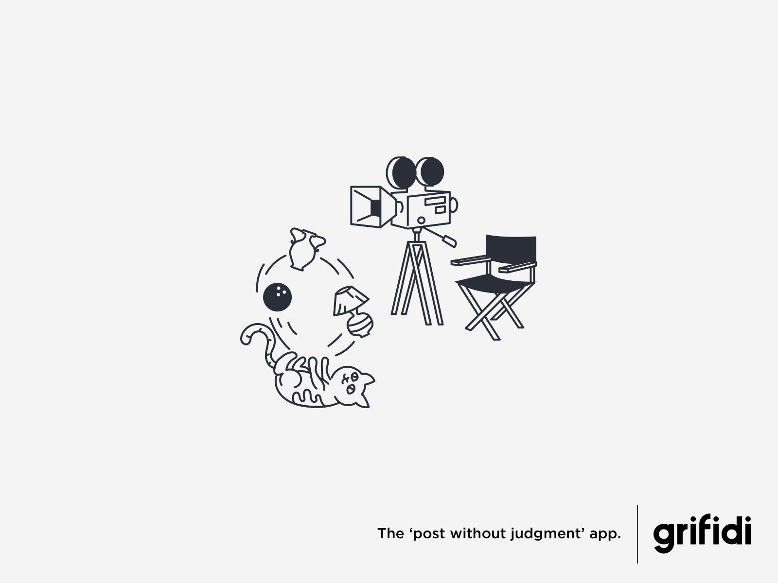
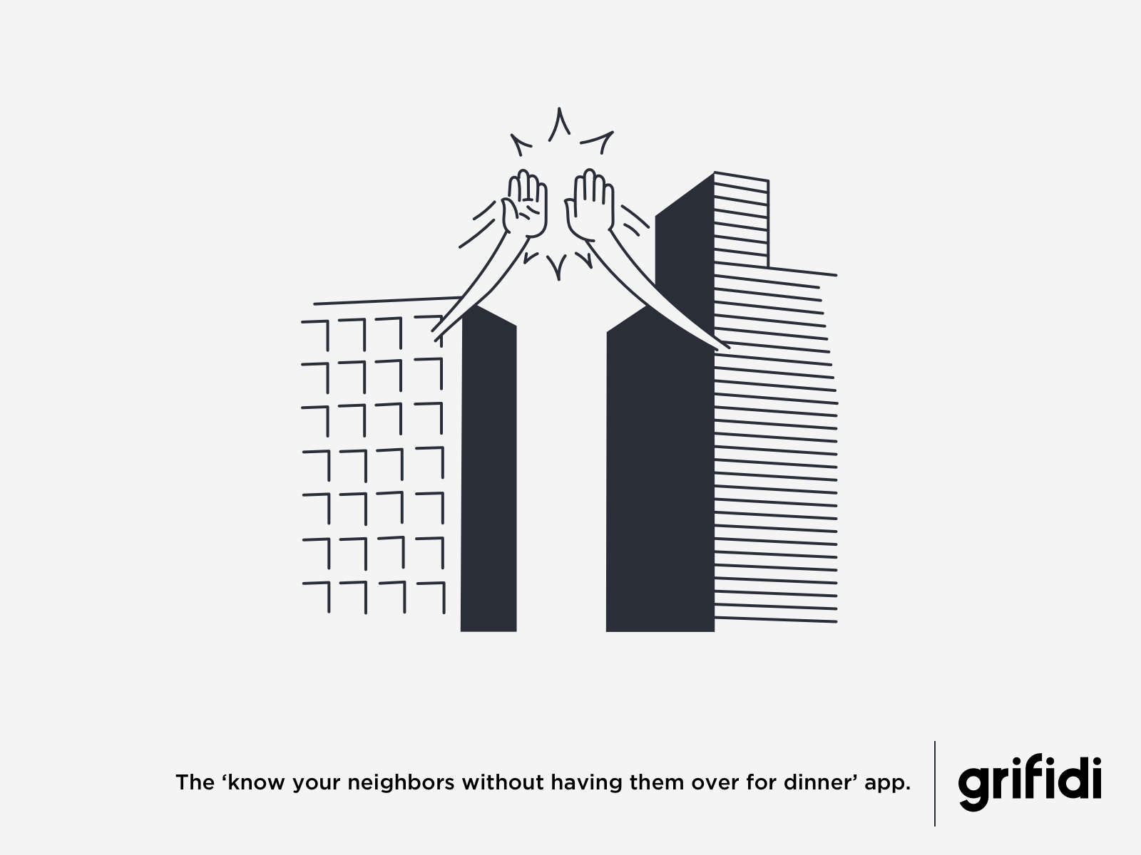
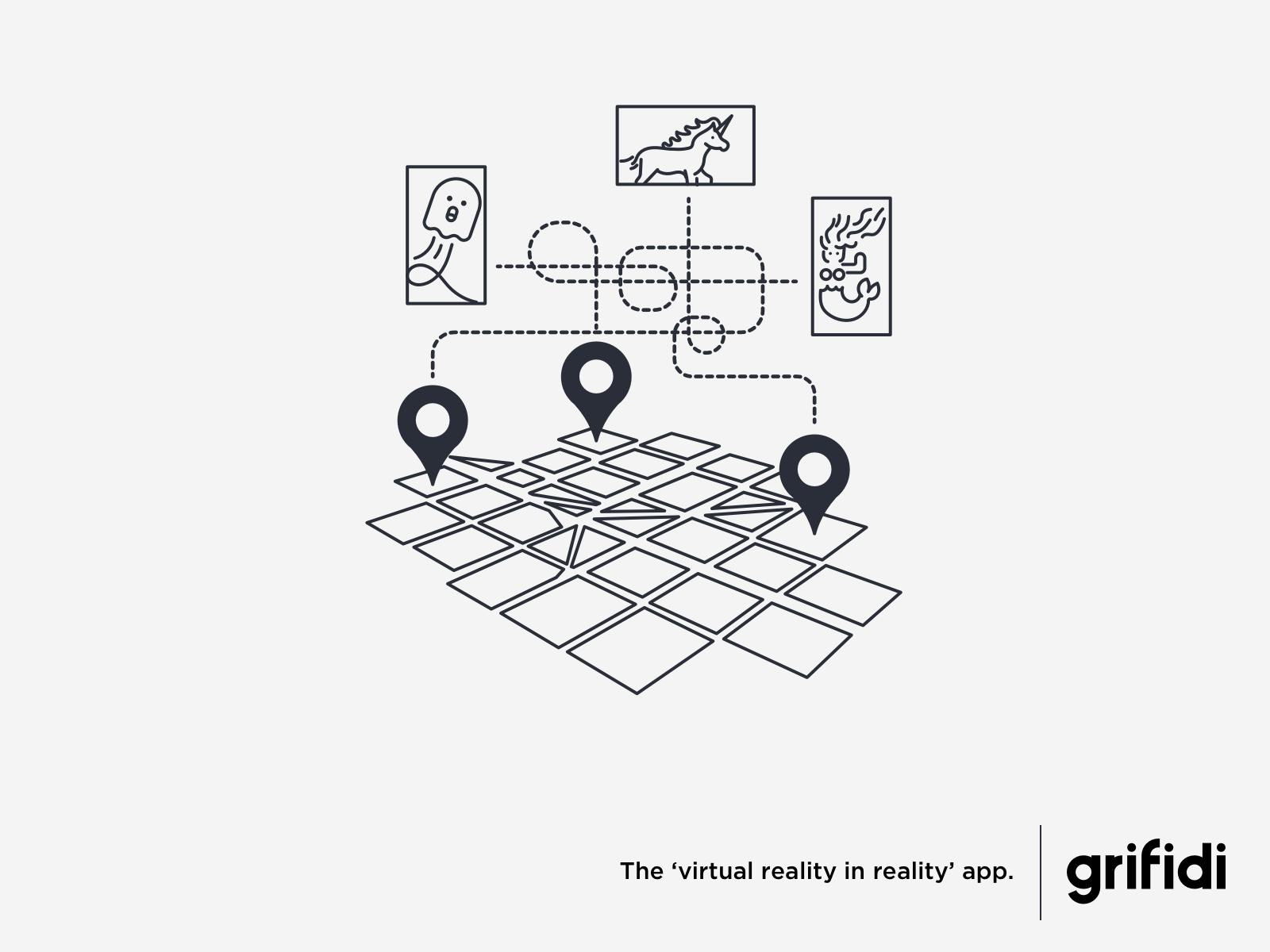
ADVERTISEMENT
The *insert funny thing here* app.
Illustrations associated in advertisements and social media posts were to be inspired by mute newspaper styled tones, further extending the contrast between our online presence and marketing material.